 MegaMegaTypeType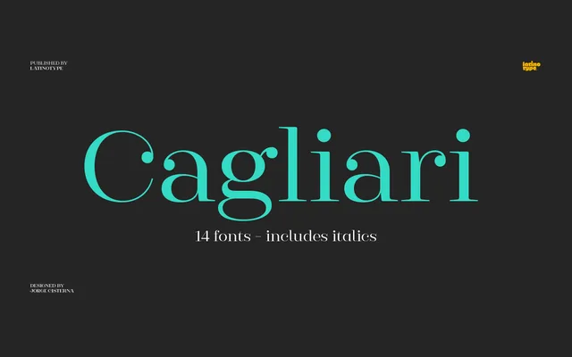
A high-contrast sans-serif from Jorge Cisterna that grafts Didone stroke drama onto neo-grotesque letterforms across seven weights with matching italics.
About
Cagliari draws on the studio's earlier Queulat design but pushes the contrast between thick and thin strokes further, making the tension visible at terminals and teardrop terminals. The neo-grotesque skeleton keeps the overall silhouette clean and restrained despite the expressive stroke modulation. Intended for fashion publishing, logotypes and editorial contexts where a touch of luxury is needed without sacrificing legibility.
Classification
A neo-grotesque structure with Didone-inspired stroke contrast, featuring abrupt thick-to-thin transitions and teardrop terminals. This places it in a high-contrast sans category, drawing from both modern serif tradition and minimalist grotesque forms.