 MegaMegaTypeType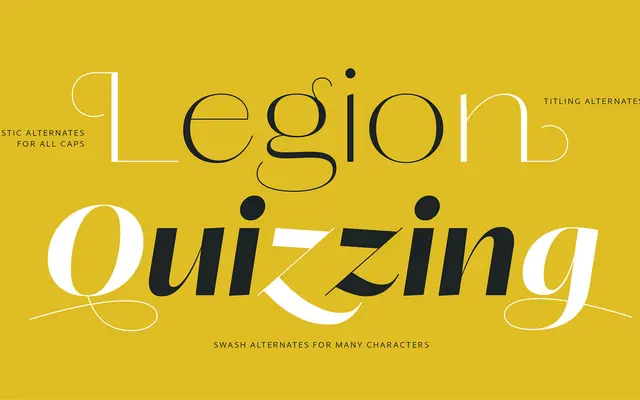
A high-contrast sans-serif companion to the Lust serif family, designed by Neil Summerour with deliberate warmth threaded through its six weights and matching italics.
About
Lust Sans completes the Lust Collection, a project that began in 2010 with the original Lust serif. Its stroke contrast is calibrated to work alongside both Lust and Lust Didone in the same layout, with six weights allowing fine modulation of typographic rhythm. The italics in particular carry a distinctly warm, slightly playful character that counters any tendency towards austerity common in the genre.
Classification
A high-contrast sans-serif with pronounced stroke variation inherited from its bracketed serif ancestor, Lust. The design sits in the tradition of Optima and Domaine Sans, using calligraphic stroke modulation without explicit serifs.