 MegaMegaTypeType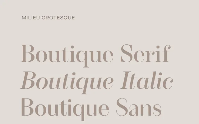
A high-contrast sans built on a Didone skeleton, expanded in 2022 into a 54-style system across three optical sizes with serifed and italic companions.
About
Originally a three-weight sans from 2012, Timo Gaessner rebuilt Boutique into a 54-style family a decade later, adding six weights across three optical sizes alongside a serifed companion and a dedicated italic. The underlying structure is Didone: vertical axis, sharp contrast, deliberate geometry, with decoration entirely absent. The result is an idiosyncratic reinterpretation of 18th-century moderns, sharpened for contemporary editorial and branding contexts.
Classification
Built on a Didone skeleton with vertical axis and pronounced stroke contrast; geometric character amplified, ornament eliminated. Not a serif despite the Didone reference — it is a high-contrast sans-serif drawing on the skeletal logic of 18th-century moderns. Expanded in 2022 into a three-optical-size system (S, M, L) covering caption through display, with a serifed companion (Boutique Serif) and a dedicated italic (Boutique Italic). 54 styles total across the full family. Six upright weights per optical size.