 MegaMegaTypeType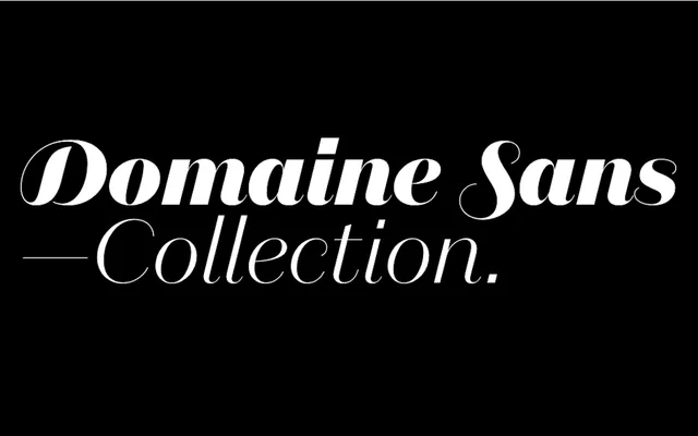
A high-contrast grotesque in three optical subfamilies, grown from the Domaine skeleton and the neglected tradition of Breite Grotesk.
About
Domaine Sans began as an experiment: stripping the serifs from Domaine Text Light to reveal the skeleton beneath, then following that logic into the under-exploited genre of sans serifs with visible stroke contrast. Sowersby drew on Optima, Britannic (1924), Breite Grotesk and the Art Deco lettering from Napier's 1931 earthquake rebuilding, using Martin Majoor's one-form principle to hold the three optical subfamilies together. Fine is for use above 60pt; Display handles headlines; Text is built for extended reading — 42 styles in total, each with italics featuring optional swash capitals across every uppercase letter.
Classification
Lineal grotesque with deliberate stroke contrast — an exploration of the Breite Grotesk subgenre. Shares the skeleton of Domaine (the Klim serif family) per Martin Majoor's one-form principle. Terminals taper to hairlines rather than flaring. Italic draws on mid-century lettering artist Mortimer Leach and features optional swash capitals for every uppercase letter. Three optical subfamilies: Fine (60pt+), Display (headlines), Text (sustained reading).