 MegaMegaTypeType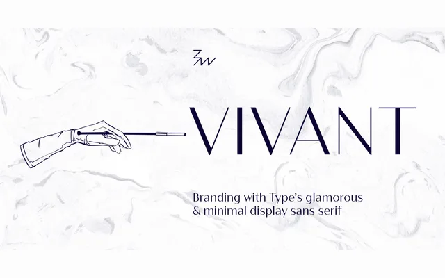
A high-contrast geometric sans in seven weights that borrows the stroke modulation of didone serifs while keeping forms strictly unadorned.
About
Bw Vivant achieves its dramatic effect by holding thin strokes constant across all seven weights, creating sharp contrast against swelling stems without resorting to serifs or decorative detail. The geometric construction and clean terminals give it a contemporary feel, while art-deco references lend a sense of period glamour. OpenType features include discretionary ligatures, stylistic sets, old-style figures and case-sensitive forms, with coverage across Extended Latin.
Classification
A high-contrast geometric sans serif with pronounced stroke modulation akin to a didone serif but stripped of serifs entirely. The constant thin strokes across all weights and art-deco sensibility place it firmly in the geometric sans tradition.