 MegaMegaTypeType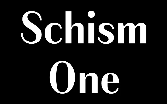
High-contrast modulated sans with a hairline stroke held constant across all weights, derived from Alias Didot.
About
Schism One is a serif-free development of Alias Didot, stripping the serifs while keeping the high contrast and condensed character. The thin stroke weight stays constant from Light to Black – a technique called grading – making the design feel like a sans Didone. Letter endings land at strict horizontal or vertical angles, giving shapes like a, c and e a slightly pinched, constricted quality. Sharp connections between curves and verticals give the family a chiselled, austere character.
Classification
High-contrast modulated sans-serif derived from Alias Didot, with serifs removed. Maintains the same thin stroke weight from Light through Black, giving it a graded quality like a Didone without serifs. Letter endings are horizontal or vertical, producing pinched forms in characters like a, c, e and s. The first of three sub-families, with the thinnest hairline stroke of the set.