 MegaMegaTypeType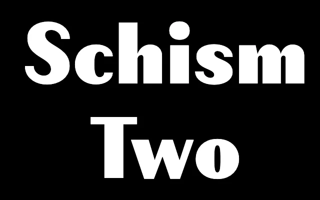
Medium-contrast modulated sans sitting between the Didone severity of Schism One and the near-grotesque quality of Schism Three.
About
Schism Two is the middle member of the three-part Schism family derived from Alias Didot. Its thin stroke is heavier than Schism One's, reducing the extreme contrast and shifting from a sans-Didone character towards something more incised. The sharp connections between curves and verticals are retained across all weights, giving it a textural and chiselled quality without the bloated weight gain typical of heavier grotesques.
Classification
Medium-contrast modulated sans-serif derived from Alias Didot. The thin stroke is heavier than in Schism One, reducing the Didone-like quality and shifting the character towards something more incised and chiselled. The connections between verticals and curves remain cut to sharp points throughout all weights.