 MegaMegaTypeType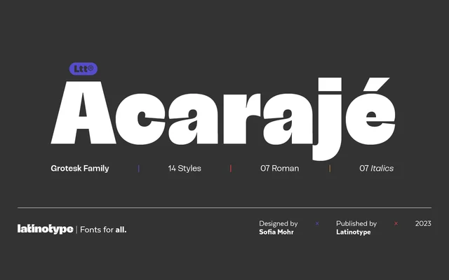
A grotesque sans-serif in seven weights with matching italics, distinguished by a stroke modulation that grows more pronounced at heavier weights.
About
Acarajé sits within the grotesque tradition but departs from strict neutrality through its modulated stroke contrast, which becomes increasingly expressive as the weight increases. The family spans 14 styles across seven weights from Light to Black, each with a matching italic. This range makes it adaptable across both body text and display settings without sacrificing its underlying character.
Classification
A grotesque sans-serif with modulated stroke contrast that increases with weight, placing it within the classic grotesque tradition while adding a more expressive character.
Weights
LightRegularMediumSemiBoldBoldExtraBoldBlack
Languages
Latin
Tags
grotesqueversatilejovialmodulatedworkhorsetexteditorial