 MegaMegaTypeType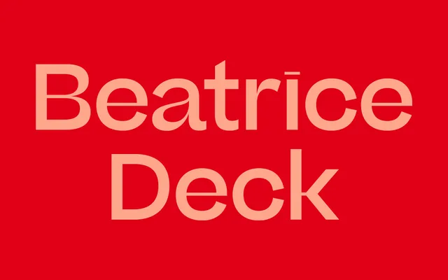
The intermediate optical size of Sharp Type's Beatrice family, drawn for editorial deck copy and subheads at sizes above running text but below the extreme contrast of Beatrice Display.
About
Beatrice Deck occupies the middle optical size in the three-part Beatrice system, calibrated for the standfirsts and secondary headlines that sit between a main headline and body copy in editorial layouts. It holds more contrast than the text cut, where legibility at small sizes demands restraint, but stops short of the hairline horizontal strokes that define Beatrice Display. Drawn by Lucas Sharp with Connor Davenport and Kia Tasbihgou, the family was released in 2018 and has become one of Sharp Type's defining editorial offerings.
Classification
Beatrice Deck is the intermediate optical size in Sharp Type's three-part Beatrice system (Text, Deck, Display). It is a high-contrast sans-serif with contrast calibrated for deck/standfirst use – above body-text range but less extreme than the hairline-horizontal Beatrice Display. The family draws on geometric forms but has humanist finishing; all three optical sizes share the same seven-weight range with matching italics.