 MegaMegaTypeType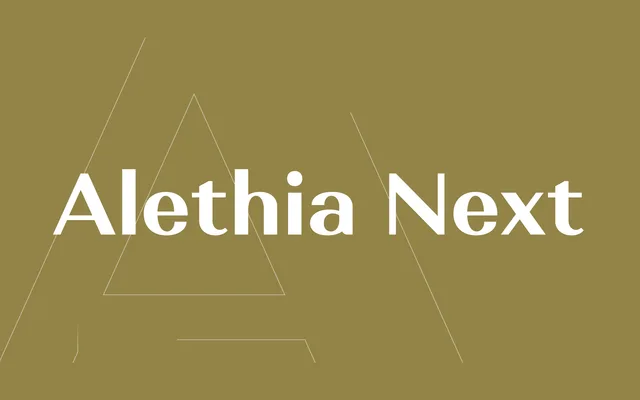
A high-contrast grotesque sans-serif in seven weights with matching italics and upright italics, suited to editorial display work alongside modern-style serifs.
About
Designed by Oleh Lishchuk and first published in May 2019, Alethia Next pairs noticeable stroke contrast with a grotesque structure uncommon for the genre, making it better suited to display settings than body text. The 21-style family covers Latin and major Cyrillic scripts including Bulgarian local forms, and includes OpenType features such as small caps, ligatures and numerous alternates. The presence of upright italics alongside conventional italics broadens its expressive range for magazine and brochure applications.
Classification
A high-contrast grotesque sans-serif designed primarily for display use, with pronounced stroke variation that sets it apart from neutral grotesques. The inclusion of upright italics alongside conventional italics adds a distinctive editorial character.