 MegaMegaTypeType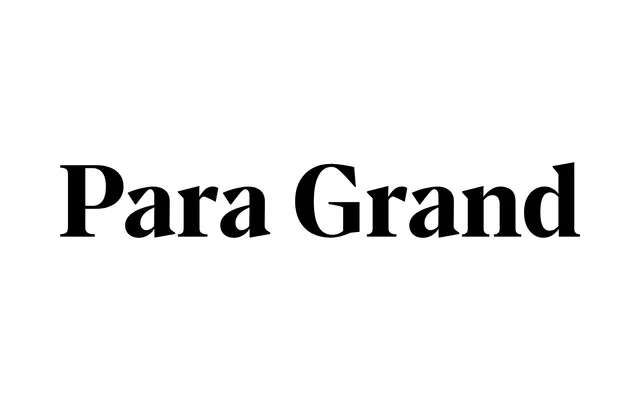
A contemporary geometric grotesque designed for display use, the largest of three optical sizes in Rellence's Para family, available in six weights with italics and variable font support.
About
Para Grand is the display-scale variant of the Para family, which Rellence positions across three optical sizes to cover text, mid-scale and headline settings. It carries six weights from Light to Super, each with a matching italic, and ships with variable font versions on a weight axis. The design mixes geometric structure with high-contrast details drawn from Didone and Transitional references, landing somewhere between cold precision and editorial warmth.
Classification
Para Grand is the display optical size of the Para family, which spans three optical variants: Superior (small text), Central (medium), and Grand (display). It sits in geometric grotesque territory with some humanist warmth and high-contrast influence drawn loosely from Didone and Transitional traditions. Six weights from Light to Super, all with matching italics, plus variable font versions (Para Grand Flex and Para Grand Italic Flex on a single weight axis). 673 glyphs per style with a full OpenType feature set including small caps, oldstyle and tabular figures, ligatures and fractions.