 MegaMegaTypeType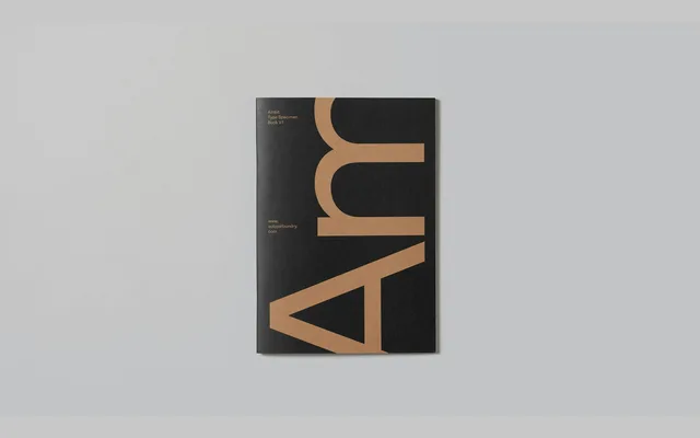
An eccentric grotesque with seven weights, defined by a curly f and r, exaggerated loops on c and s, and twisting legs on R and K – personality without novelty.
About
Launched in 2019 as one of CoType Foundry's founding typefaces, Ambit draws from early grotesque traditions while adding distinctly contemporary details. A curly f and r, exaggerated bottom loops on c and s, and kinetic legs on R and K give the design genuine character. Seven weights with matching oblique italics, a variable axis for fine-grained control, and three stylistic sets make it well suited to branding, packaging and editorial work.
Classification
Contemporary grotesque with deliberate idiosyncrasies: a curly f and r, exaggerated bottom loops on c and s, and twisting legs on R and K. Three stylistic sets offer alternate letterforms including single-storey a and g, a simplified f and r suited to smaller sizes, and an alternate Q. Variable font with a continuous weight axis spanning Thin to Black.