 MegaMegaTypeType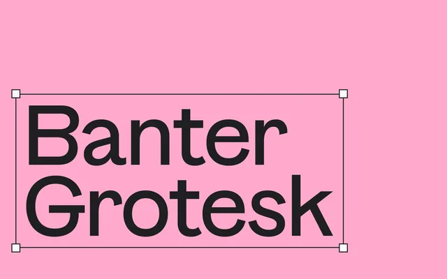
A 12-style grotesque with deliberately top-heavy proportions and angled terminals — 11 stylistic sets let it shift from playful to punchy.
About
Banter Grotesk inverts the usual optical corrections: capitals and numerals are heavier at the top than the bottom, creating a subtle built-in tension. Angled terminals and 11 stylistic sets — including an 'edgy' set that sharpens the character considerably — give it a range from approachable to confrontational. The family ships as a variable font with weight and slant axes, 650+ characters, circled numerals, fractions and ligatures.
Classification
A display grotesque with deliberately inverted proportions — capitals and numerals are top-heavy, reversing the conventional optical correction. Angled terminals and 11 stylistic sets push it toward the expressive end of the sans spectrum. Variable weight and slant axes.