 MegaMegaTypeType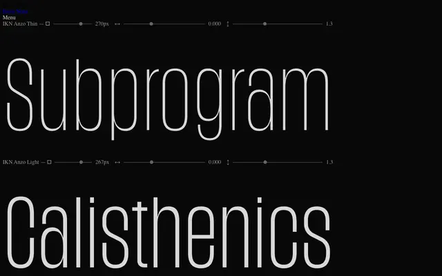
A condensed sans-serif in six weights by Andreas Eijerfors and Maria Fredman, designed for space efficiency with tight ascenders and diacritics and optional rounded alternates.
About
Tall, narrow proportions and a restrained vertical rhythm make IKN Anzo well suited to headlines, packaging and editorial layouts where horizontal density matters. Ascenders, descenders and diacritics are drawn close to the core letterforms to maintain an even typographic colour. Six stylistic sets allow the default linear strictness to be relaxed through single-storey a, alternate capital I, and rounded variants on selected letters.
Classification
A purpose-built condensed sans with tall, narrow proportions and even stroke weight. The controlled structure and space-efficient letterforms place it firmly in the condensed grotesque tradition, with optional rounded alternates softening the otherwise strictly linear forms.