 MegaMegaTypeType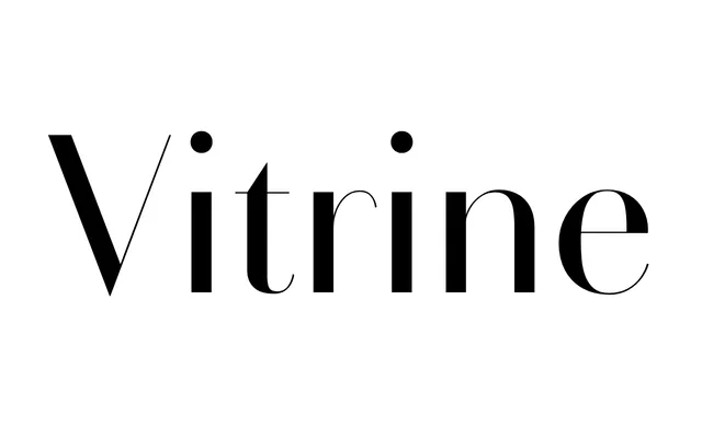
A high-contrast display sans that strips the serifs from a Didone skeleton for a crystalline, fashion-editorial look.
About
RT Vitrine started as an exploration of Didone display type and ended up somewhere else: serifs removed, stroke endings weightless, the letterforms reduced to a near see-through quality. Nine weights from Razor to Black give it real range for fashion and editorial display work.
Classification
A Didone-derived display face with its serifs cut away, leaving a high-contrast sans; classified as sans-serif because the foundry itself labels it a Display Sans.
Weights
RazorThinExtralightLightRegularMediumSemiboldBoldBlack
Languages
Latin Extended
Tags
high-contrastdidonedisplayfashioneditorial