 MegaMegaTypeType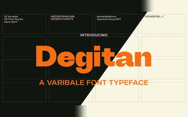
A high-contrast transitional serif spanning nine weights and three widths, with swollen stems that become more pronounced at heavier settings.
About
Degitan takes its cues from transitional and contemporary serif models, using optical correction at lighter weights to soften the contrast and produce a warmer texture. At heavier weights, swollen stems and increased contrast give the design greater visual presence. The 54-style family covers Regular, Condensed and Semi Condensed widths with full italic companions throughout, targeting headlines, branding and packaging use.
Classification
High-contrast serif drawing on transitional and contemporary serif conventions, with swollen stems and natural curves that intensify at heavier weights. The contrast modulation and optical corrections at lighter weights place it firmly in the transitional serif tradition.