 MegaMegaTypeType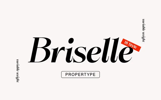
A high-contrast transitional serif in nine weights with matching italics, designed to shift from soft and warm at lighter settings to dramatically pronounced at heavier ones.
About
Briselle spans thin to black across 18 styles, with the contrast, bulging stems and slanted strokes becoming increasingly dramatic as weight increases. Lighter cuts are optically corrected to maintain a warmer, softer character. The family is suited to both display use and extended text, covering headlines, branding, packaging and editorial applications.
Classification
High-contrast design inspired by transitional and contemporary serif models, with bulging stems and prominent slants at heavier weights, placing it squarely in the transitional serif tradition with contemporary refinements.