 MegaMegaTypeType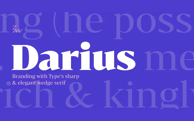
A high-contrast wedge serif by Alberto Romanos that sits between the transitional and Didone traditions, offered in six weights with matching italics and a companion stencil version.
About
Bw Darius uses a wide skeleton, modern proportions and elevated stroke contrast to achieve an opulent character without the rigidity typical of Didone designs. Its tall x-height and open apertures make it workable at both display and body text sizes, on screen and in print. Six weights from Light to Black each carry matching true italics, totalling 12 styles.
Classification
A high-contrast wedge serif positioned between the transitional and Didone genres, with sharp terminals that stop short of Didone stiffness. Wide skeleton and modern proportions place it closer to contemporary editorial serifs.