 MegaMegaTypeType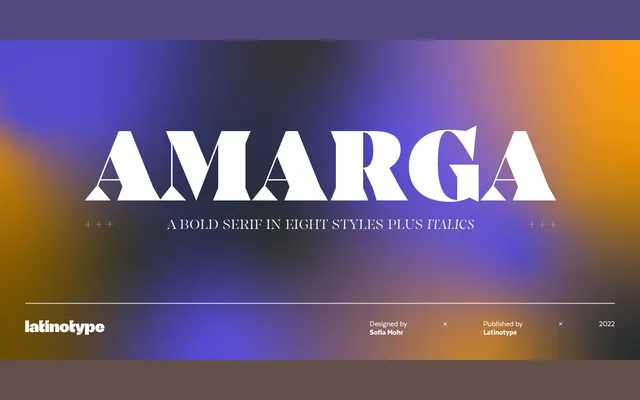
A high-contrast display serif by Sofia Mohr, spanning nine weights with italics and defined by pointed terminals inspired by the bitterness of coffee.
About
Amarga draws its character from sharp, pointed terminals and strong stroke contrast, giving it a bold visual presence suited to editorial design, posters and branding. Nine weights run from Thin to Black, each paired with an italic, yielding 18 styles in total. The family works best at larger sizes where its high contrast and pointed details can be fully appreciated.
Classification
A high-contrast serif with pointed terminals and strong stroke variation, designed primarily for display use. Its dramatic contrast and sharp terminals align it with a modern or Didone-influenced display serif tradition.
Weights
ThinExtraLightLightRegularMediumSemiBoldBoldExtraBoldBlack
Languages
Latin
Tags
serifdisplayhigh-contrasteditorialbrandingposterpointed-terminalsdidone