 MegaMegaTypeType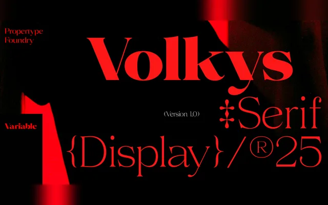
A high-contrast transitional serif spanning nine weights with matching italics and a variable font, designed for both display and text settings.
About
Contrast increases markedly through the weight range, with bulging stems and prominent slants becoming more visible in heavier cuts, while thinner weights reduce contrast for a softer, warmer tone. The family covers nine weights from Thin to Black, each with a matching italic, totalling 18 static styles plus a variable font. Intended for headlines, branding, packaging and magazine work, with extensive multilingual Latin support.
Classification
High-contrast serif drawing from transitional and contemporary serif traditions, with contrast increasing progressively through the weight range and optical corrections applied at lighter weights for a warmer appearance.