 MegaMegaTypeType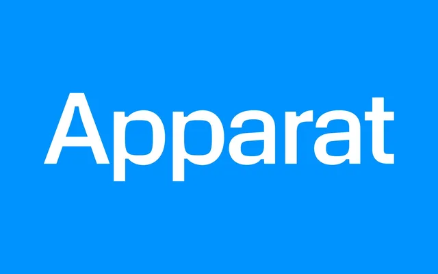
A seven-weight sans-serif rooted in early 1970s TV-broadcast typography, using high counter curve tension and large ink traps to sustain legibility across screen and print.
About
Apparat takes the broadcast-optimised sans-serif tradition of the early 1970s as its starting point, exaggerating counter tension against calmer outer shapes and opening junctions with generous ink traps. The result works convincingly at both text and display sizes, with an angular, purposeful character that reads clearly in digital environments. The family covers 88 languages and 549 glyphs, including circled numerals, analogue clock symbols and a digital clock OpenType feature.
Classification
A geometric-leaning sans-serif with strong counter curve tension and large ink traps at junctions, drawing from early 1970s broadcast-optimised typefaces. The design is engineered for legibility at both display and text sizes on screen and print.