 MegaMegaTypeType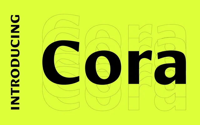
A humanist sans-serif by Bart Blubaugh with wide proportions and a generous x-height, designed to hold up at small sizes on screen while remaining attractive in print.
About
Cora's letterforms are slightly wide and appear large on the body, ensuring legibility at small point sizes without sacrificing elegance in print contexts. Three weights with matching italics cover the range of typical editorial use, and the family includes a well-considered set of OpenType features: small capitals, oldstyle figures, stylistic alternates and case-sensitive forms. Its proportions are forgiving enough to tolerate condensation or expansion without losing coherence.
Classification
A humanist sans-serif with slightly wide proportions and generous x-height, designed to maintain clarity at small sizes on screen while remaining attractive in print. Its forthright letterforms tolerate condensation and expansion without severe distortion.