 MegaMegaTypeType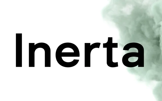
A geometric-meets-neo-grotesque hybrid from Andriy Konstantynov, built for UI/UX legibility across 18 styles with broad Latin and Cyrillic coverage.
About
Sitting between geometric construction and neo-grotesque neutrality, Inerta is designed to remain readable at small screen sizes without losing typographic personality. The family spans nine weights with matching italics and over 950 glyphs, with OpenType alternate sets including Bulgarian Cyrillic and alternative Ukrainian forms. Two Light styles are available free of charge.
Classification
Positioned explicitly as a cross between geometric sans and neo-grotesque, combining the rational construction of geometric designs with the neutral, functional character of neo-grotesques. Intended for UI/UX environments and small-size legibility.