 MegaMegaTypeType
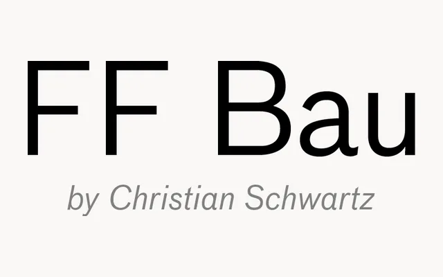
Christian Schwartz's revival of the Schelter & Giesecke Grotesk, the sans the Bauhaus used, released by FontFont in 2002.
About
FF Bau brings back an early German grotesque with all its quirks intact: uneven widths, a slightly rough rhythm and plenty of character in the bolds. It feels warmer and older than a neo-grotesque, which suits editorial design, cultural posters and identities after a period flavour.
Classification
Revival of the Grotesk issued by the Schelter & Giesecke foundry in Leipzig in the late 19th century, a face later used at the Bauhaus. Drawn by Christian Schwartz in Regular, Medium, Bold and Super with italics.
Weights
RegularMediumBoldSuper
Languages
Latin
Tags
sans-serifgrotesquerevivalbauhauseditorialheadline