 MegaMegaTypeType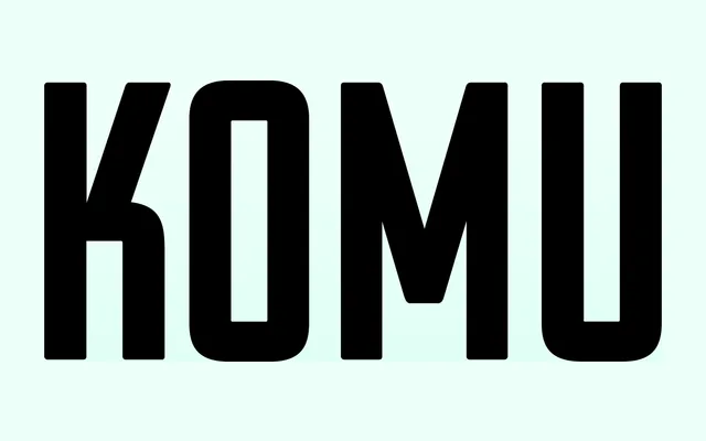
A two-style revival of the all-caps aluminium foil billboard lettering ubiquitous in socialist-era Czechoslovakia, with Style A offering squarish idiosyncratic forms and Style B presenting rounder, more uniform characters.
About
Komu recreates the optical quirks of letters picked from a box and pinned to styrofoam boards, deliberately retaining the slight tonal disparity between characters that gave the original its handmade quality. Style A is distinguished by angular forms and distinctive glyphs such as the K, 5 and narrow E, while Style B takes a rounder approach with more consistent stroke widths. The typeface has appeared in Marvel Studios' Captain America: Civil War, HBO's Burning Bush and Paramount+'s 1883 series, demonstrating its reach beyond Central European historical contexts.
Classification
All-caps geometric sans-serif revival drawn from hand-assembled aluminium foil billboard lettering used in socialist-era Czechoslovakia. Its display-only, capitals-first nature and historical source material place it firmly in the display category rather than a general-purpose sans.