 MegaMegaTypeType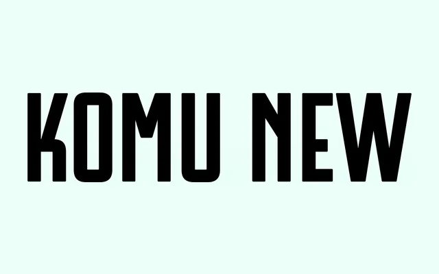
A four-style, capitals-only display family reinterpreting mid-century Eastern European socialist grotesques, drawing from posters, shop windows, factory signage and hand-painted banners.
About
Each of the four styles (C, D, E, F) is derived from distinct period sources, differing in middle stroke position, rounding, width and proportion, yet merged into a coherent family through shared base proportions and complementary diacritics. The design continues the noticeboard typefaces Komu A and Komu B, expanding the concept by consolidating multiple grotesque traditions into a single working system. OpenType features include contextual alternates for arrows and ligatures, alongside broad European Latin language support.
Classification
A capitals-only display sans-serif rooted in socialist modernist grotesque traditions, with four stylistic variants drawing from mid-century Eastern European propaganda and noticeboard lettering. The all-caps constraint and bold proportions place it firmly in the display category.