 MegaMegaTypeType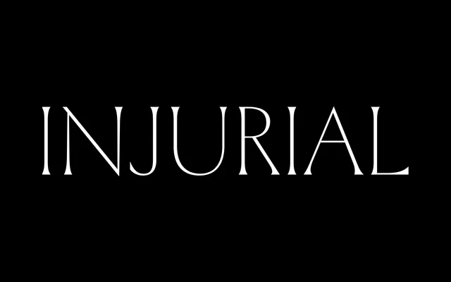
A capitals-only glyphic serif designed by Sandrine Nugue for titling, born from the editorial design of a French novel and conceived specifically for setting insults with elegance.
About
Derived from monumental Roman capital proportions, Injurial carries a light weight with very slight stroke contrast and sharp incised details. It originated in 2014 during the design of a Heinrich Böll novel published by Tripode, where aggressive graffiti within the narrative demanded a typeface that could hold its own. A single Regular style is available, supported by OpenType features including contextual alternates, fractions, ordinals and directional arrows.
Classification
An incise or glyphic serif consisting solely of capitals, with monumental Roman proportions and very slight stroke contrast. Designed for titling use, its sharp, elegant cuts place it firmly in the display category.