 MegaMegaTypeType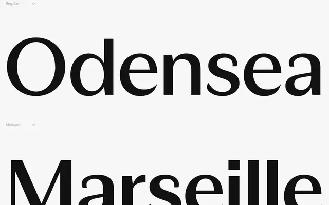
A geometric sans-serif with restrained stroke modulation, suited to editorial layouts, UI systems and photographic labelling across seven weights with matching italics.
About
FH Noetica Text draws on the territory between Cassandre's Peignot and Zapf's Optima, blending geometric construction with subtle tonal contrast. The result is a typeface that reads as neutral without being anonymous, maintaining spatial clarity and architectural rhythm across both text and display settings. It is released as two subfamilies, Text and Display, each spanning seven weights with italics.
Classification
A geometric sans-serif with subtle stroke modulation, drawing influence from Cassandre's Peignot and Zapf's Optima. It sits between strict geometric and humanist classifications due to its tonal contrast and optical sensitivity.