 MegaMegaTypeType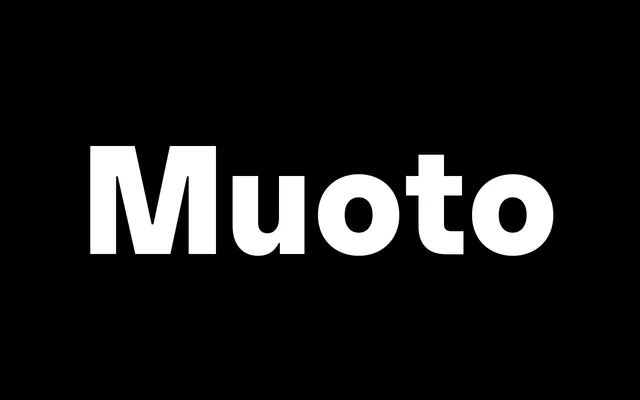
A warmly modernist geometric sans from Matthieu Cortat, spanning six weights, four widths and a monospaced companion, with its design grounded in Alvar Aalto's principle of functional warmth.
About
Commissioned by Base Design to succeed their Basetica, Muoto pairs full curves with solid stems to produce a sans that reads as functional without feeling cold. The family covers four widths – Ultra Condensed, Condensed, Regular and Extended – across six weights and matching italics in both static and variable formats, the latter expanded in 2022. A monospaced sibling, Muoto Mono, extends the system into tabular and coding contexts.
Classification
Geometric sans with deliberate humanist warmth – full curves and considered proportions distinguish it from cold neutralists like Helvetica or Univers. The Alvar Aalto design philosophy and collaborative commission by Base Design give it a hybrid humanist-geometric character that sits closer to Graphik than to Futura.