 MegaMegaTypeType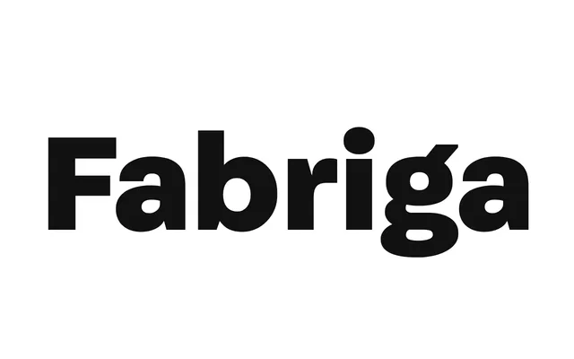
A humanist sans-serif family by Greg Lindy, released in 2016 across five weights with matching italics, designed around clarity and tonal warmth.
About
Fabriga approaches its character set as an ensemble, balancing structural consistency with considered individual letterform decisions. Its warmth and legibility make it well-suited to a supportive typographic role across a range of applications. Ten styles cover light through black, all with italics, in OTF, WOFF, WOFF2 and EOT formats.
Classification
Fabriga displays characteristics of a humanist sans-serif, with warmth and clarity suggesting organic influences alongside functional structure. The ensemble approach to the character set and the emphasis on tone point away from purely geometric or grotesque models.
Weights
LightRegularMediumBoldBlack
Languages
Latin
Tags
humanistsans-seriffunctionalwarmworkhorseeditorialclean