 MegaMegaTypeType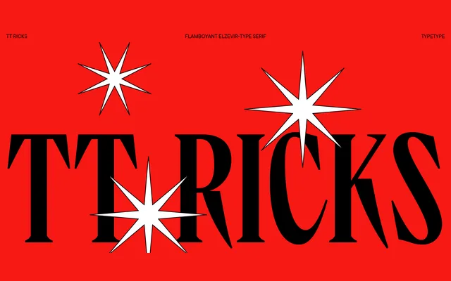
A sharp, high-contrast display serif inspired by Gustav F. Schroeder's 1892 De Vinne typeface, distinguished by thorn-like serifs, narrow letterforms and a diagonal oval axis across three roman weights plus a variable font.
About
TT Ricks takes the De Vinne historical prototype as a loose starting point, then departs freely: thorn-like serifs, extremely dense spacing and narrow proportions give it an aggressive character that softens somewhat in the bolder weights, where Gothic traits emerge. Peculiarities include a diagonal axis on rounded characters, distinctive Latin lowercase forms and asymmetrical descending strokes on Cyrillic Дд and Цц. A 2024 update expanded the character set from 553 to 1009 glyphs, added Cyrillic support, 31 OpenType features and coverage for 230+ languages including Bulgarian, Serbian, Chuvash and Bashkir localisations.
Classification
A high-contrast elzevir-style serif with thorn-like serifs, narrow proportions and a diagonal oval axis, loosely inspired by the 1892 De Vinne typeface. Its extreme contrast, dense spacing and angular details place it firmly in the display serif camp.