 MegaMegaTypeType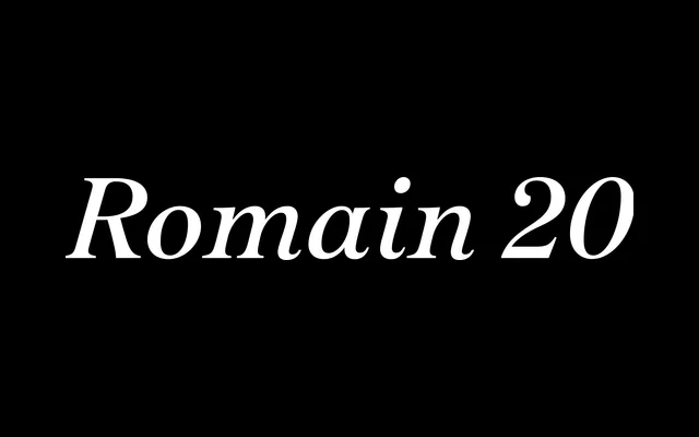
Alice Savoie's eight-year revival of a turn-of-the-century French elzevir, adapted from the Fonderie Allainguillaume's Romain Vingtième siècle for contemporary text setting.
About
The original metal typeface appeared in a 1902 issue of La fonderie typographique and combines soft bowl terminals with sharp bracketed serifs, giving it a texture that sits somewhere between French publishing convention and Art Nouveau decorative impulse. The roman and italic were conceived for continuous text at small sizes, with generous proportions that keep the italic readable in extended settings. The bold is considerably darker than the roman, making it well-suited to display use alongside the lighter cuts.
Classification
A contemporary revival of a late nineteenth-century French elzevir, characterised by bracketed serifs, soft bowl terminals and moderate contrast – placing it firmly within the French old-style serif tradition with hints of Art Nouveau ornament.