 MegaMegaTypeType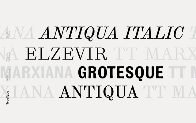
A meticulous two-year reconstruction of three typefaces from the 1887 editions of the Russian magazine 'Niva', preserving period printing artefacts across a scotch serif, an old grotesque and a decorative Elzevir.
About
Each of the three subfamilies draws directly from paper sources: the Antiqua retains dot gain and letterform deformations characteristic of late 19th-century printing, the Grotesque includes an inversion set suited to period advertising, and the Elzevir features swash uppercase alternates and sharper, higher-contrast forms suited to display use. Pre-revolutionary Cyrillic spelling is supported via OpenType stylistic sets, alongside oldstyle figures, standard ligatures and case-sensitive forms. The project was developed over two years, prioritising historical fidelity over modernisation.
Classification
The primary Antiqua subfamily is a scotch-style serif revival with deliberate period printing artefacts. The family also encompasses an old grotesque and a decorative Elzevir display face, but the core classification follows the Antiqua.