 MegaMegaTypeType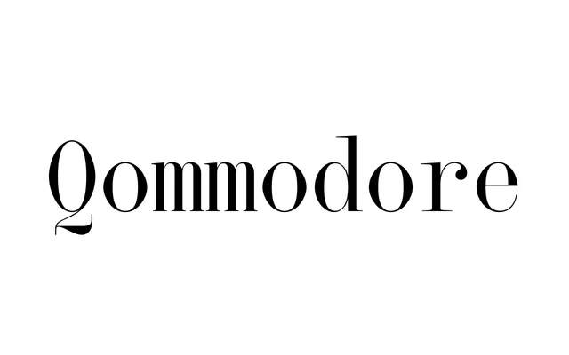
A high-contrast display serif that imposes monospaced proportions on 19th-century display type construction, producing a deliberately glitchy texture as weight increases compress interior space.
About
Born from a collaboration between Hugues Gentile and Jean-Baptiste Levée, Qommodore fuses a classical hairline-to-thick-stroke contrast with fixed character widths that distort the natural proportions of its historical references. At lighter weights the skeleton feels open and wide; at ExtraBold, swelling thick strokes crowd the counter forms and generate a dramatic, almost corrupted texture. Quirky details throughout – the serifs on the lowercase t, a corseted R, and an eponymous Q – reward close inspection across both Latin and Cyrillic scripts.
Classification
A high-contrast serif constructed after 19th-century display types, but forced into monospaced proportions throughout. The tension between hairline and thick strokes, combined with fixed character widths, gives it an experimental, glitchy quality distinct from conventional display serifs.