 MegaMegaTypeType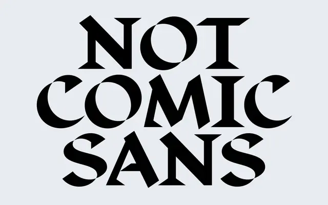
A deliberately fractured serif by Denis Serebryakov in which the serifs themselves become unstable elements, varying in presence and prominence across seven upright weights.
About
Released in 2019 as an extension of the Displace family, this typeface treats structural deformation as a design principle rather than a defect. Serifs appear, recede and vanish depending on weight, producing characters that feel eroded rather than refined. The underlying logic traces back to the broad-nib pen, keeping the family anchored within a humanist tradition even as its surfaces work against it.
Classification
Categorised as serif though it deliberately subverts the classification: serifs are inconsistent, absent in places, and treated as a variable aesthetic element rather than a structural constant. The broad-nib pen logic situates it within the humanist tradition, however distorted.