 MegaMegaTypeType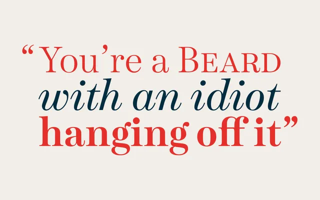
A contemporary Scotch Roman in two optical sizes – Text and Display – each spanning seven weights with matching italics and an extensive OpenType feature set.
About
Designed from scratch rather than as a nostalgic revival, Schotis draws on the British high-contrast, wide-proportion tradition stemming from William Miller's Pica No. 2 of 1813. Each optical size family offers seven weights with matching italics, 1,102 glyphs per font, small caps, multiple figure styles, ligatures and full support for Latin-based languages including Vietnamese. The name references the chotis, a dance and music style characteristic of Madrid.
Classification
Schotis follows the Scotch Roman tradition: high contrast, vertical stress and wide proportions rooted in the British route of early 19th-century moderns, specifically William Miller's Pica No. 2 (1813). Two optical sizes – Text and Display – distinguish it from a single-purpose revival.