 MegaMegaTypeType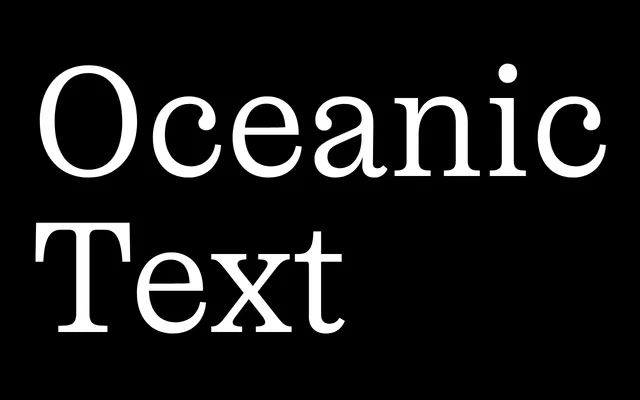
A text-optimised high-contrast serif with roots in 19th-century fat faces, disciplined for continuous reading without losing its distinctive biomorphic character.
About
Oceanic Text is Interval Type's text-weight companion to their expressive display serif, drawing on the upright contrast of fat faces in the tradition of Bodoni and Scotch Roman. The text subfamily reduces contrast and applies a slight condensation, making it genuinely usable at reading sizes while retaining the quirky letterforms – most notably the lowercase c and e, which echo prehistoric sea creatures. Extended Latin and Cyrillic support make it well-suited to multilingual editorial work.
Classification
High-contrast serif in the fat face tradition, referencing Bodoni, Canon and Scotch Roman. The Text subfamily reduces contrast and applies a slight condensation relative to the Display variant, making the design viable at reading sizes while retaining distinctively biomorphic letterforms – particularly the lowercase c and e. Supports extended Latin and Cyrillic.