 MegaMegaTypeType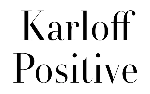
Part of a three-family system by Typotheque that pairs high-contrast serif design with reversed-contrast and neutral counterparts across three weights.
About
Karloff Positive is the high-contrast serif arm of a systematic type family that includes Karloff Negative and Karloff Neutral, each exploring a different relationship between stroke weight and optical expectation. Three weights run from Regular to Bold, each with an italic, giving designers a structured palette for working across the full spectrum of contrast. The family is named after a series of cities, suggesting broad multilingual ambition beyond its current Latin coverage.
Classification
Karloff Positive is part of a system contrasting high stroke contrast (Positive) with reversed contrast (Negative) and neutral stroke contrast, placing it firmly in the contrasted serif tradition with deliberate exploration of optical and structural opposites.