 MegaMegaTypeType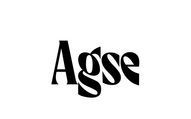
A narrow, Art Nouveau-inflected display serif by Elena Novoselova, derived from a 1917 book cover and distinguished by dramatically slanted ovals and vertical grasping serifs.
About
Originating from a lettering exercise set in the Playfaces Telegram community, Agse combines the character of an early twentieth-century typographic prototype with contemporary calligraphic movement and Art Nouveau plasticity. Its defining traits are ovals that tilt in alternating directions and serifs that grip the vertical strokes with unusual force. Intended as a headline face, it pairs well with quieter serif or sans-serif text companions and tolerates decorative treatments such as shadow and outline.
Classification
A narrow old-style serif with extremely slanted ovals and vertical grasping serifs, rooted in a 1917 historical prototype and inflected with Art Nouveau plasticity and modern calligraphy.