 MegaMegaTypeType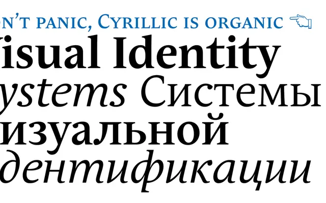
A quietly narrowed text serif designed to read smoothly at length without looking condensed.
About
Andulka was drawn in 2004 for publications and visual identity work, and its narrowed width is disguised by how smoothly it reads. It has a sans companion, Andulka Sans, so a whole publishing house can be typeset from one system. Cyrillic support widens its reach across Central and Eastern Europe.
Classification
A text serif with proportions quietly narrowed for economy, drawn for continuous reading in magazines and scientific volumes.
Weights
BookRegularMediumBold
Languages
Latin ExtendedCyrillic
Tags
economicalnarrowmagazineeditorialcyrillic