 MegaMegaTypeType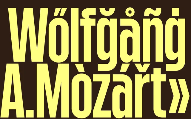
A condensed single-weight display sans by Marco Rollo, built for tight line spacing and logotype work, with three stylistic sets that shift its character from playful to technological.
About
Short ascenders and descenders allow for dense, compact compositions, making it well suited to headlines and logotypes where space is at a premium. Three stylistic sets alter key characters – a, g and y – offering distinct tonal shifts within a single weight. Additional features include an arrow set, standard and discretionary ligatures, and alternate parentheses and slashes calibrated to letter height for clean all-caps spacing.
Classification
A condensed sans-serif display typeface with short ascenders and descenders, designed primarily for logotypes and headlines. Its single-weight offering and emphasis on compact compositions place it firmly in the display category rather than a general-purpose sans.