 MegaMegaTypeType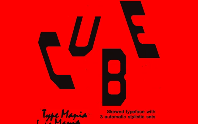
A single-weight brutalist display face that uses three auto-alternating stylistic sets to introduce rhythm and variation into otherwise rigid, blunt geometry.
About
Cube TM takes the blunt stroke terminals and rigid structure of brutalist design, then undercuts the monotony with an OpenType trick: three stylistic sets rotate automatically as text is set, so consecutive glyphs shift form without manual selection. The effect is somewhere between severe and playful. At 314 glyphs with diacritic and currency support, the coverage is solid for a single-weight display release, though it is built for headlines and posters rather than running copy.
Classification
A display-weight geometric sans-serif with heavy brutalist influence. Blunt, rigid stroke terminals. The defining feature is three OpenType stylistic sets that cycle automatically during typesetting, breaking visual monotony without manual intervention. Single weight; no italics or condensed cuts.