 MegaMegaTypeType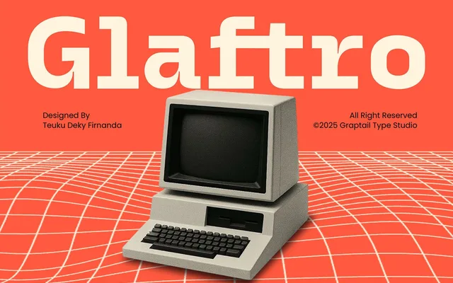
A single-weight bold display sans built around prominent ink-trap cuts and 10 stylistic ligatures, aimed at logotype and headline work.
About
Glaftro's defining feature is its ink-trap detailing, which gives junctions a sharp, angular quality that reads well at large sizes on screen and in print. The typeface ships in one weight with uppercase, lowercase, numerals and punctuation, plus a ligature set for typographic compositions. With only one style available, its application is narrow, best suited to display and branding contexts.
Classification
A bold, single-weight display sans with prominent ink-trap detailing and strong geometric cuts, placing it firmly in the display category rather than a functional text sans.
Weights
Bold
Languages
Latin
Tags
boldinktrapdisplaygeometricligatureslogotypesingle-weight