 MegaMegaTypeType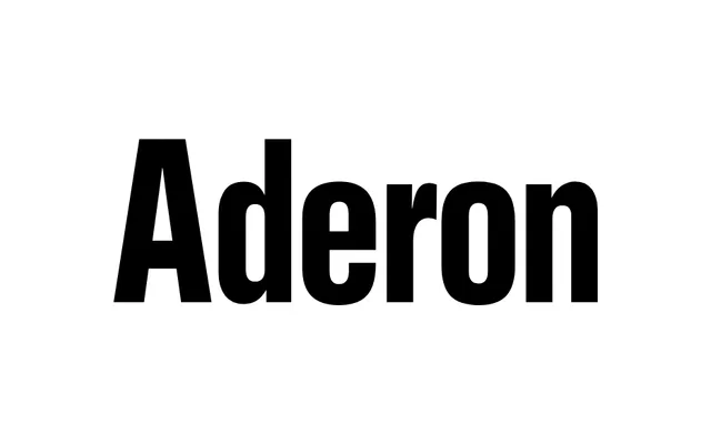
A tightly spaced condensed display sans in seven weights with true italics, designed for confident headlines where column width is tight and personality counts.
About
Aderon is a condensed display sans-serif built for headlines and compact layouts. Its warm curves and consistent proportions keep text clear even at narrow widths, balancing punch with legibility. Seven weights run from Regular to Dark, each with a true italic, and the family is also available as Aderon Flex – a variable font covering weight and italic axes in a single file.
Classification
Tightly spaced condensed display sans-serif. Seven static weights (Regular through Dark) each with a true italic, plus Aderon Flex – a variable font with weight and italic axes. No separate condensed subfamily; the compact proportions are intrinsic to the design. Warm curves and moderate contrast. 561 glyphs.