 MegaMegaTypeType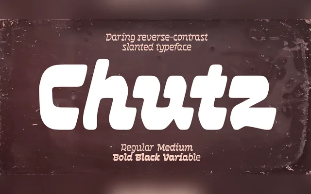
A slanted display typeface designed for a Brooklyn-based Jewish food brand, combining Hebrew calligraphic conventions with Latin, Greek and Cyrillic forms through reversed stroke contrast and alternating letter slant directions.
About
Horizontal strokes are thicker than verticals, inverting the typical Latin contrast to evoke Hebrew script's calligraphic logic. Letters are divided between a rightward Latin slant and a leftward Hebrew slant depending on their form, producing an intentional restlessness across the line. Bolder weights incorporate soft rounding and increased typographic colour to suggest the texture of dough.
Classification
A deliberately slanted display typeface with horizontal contrast and mixed directional slanting, drawing on Hebrew calligraphic conventions applied to Latin, Greek, Cyrillic, Georgian, Arabic and Hebrew scripts. The reversed stroke contrast and alternating slant angles place it firmly in display territory.