 MegaMegaTypeType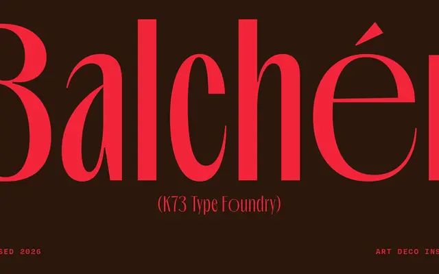
An Art Deco-inspired high-contrast display sans by Bagas Ferdiansah, offered in seven weights plus a variable font, drawing on the architectural lettering and luxury signage of the 1920s and 1930s.
About
Sharp stroke contrast and geometric discipline define this display typeface, which takes its cues from Deco-era architectural signage and upmarket commercial lettering. Open counterforms and controlled proportions make it suited to headlines, editorial titles and branding work. A variable font axis spans the full weight range from Thin to Bold, giving designers precise control without switching styles.
Classification
A high-contrast sans serif with strong vertical stress and sharp stroke modulation inspired by Art Deco architectural lettering. Its sculptural rhythm and compressed proportions place it firmly in the display category rather than conventional text sans classification.