 MegaMegaTypeType
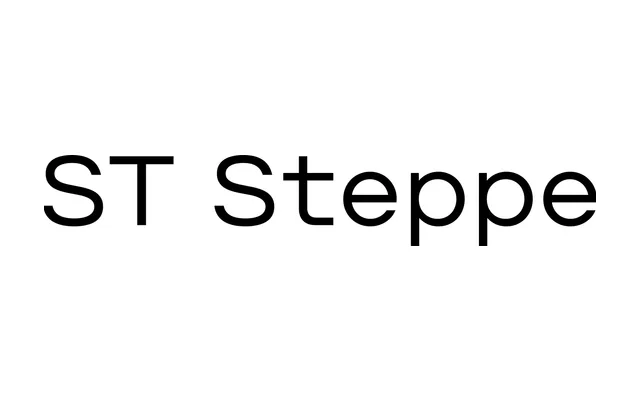
A hyperstatic geometric grotesque in which characters tend toward equal width, producing an open, spacious rhythm suited to navigation, IT and advertising contexts.
About
ST Steppe is built around the idea of near-equal character widths, deliberately breaking conventional proportions to create an airy, mechanised texture. Large x-height, closed apertures and almost circular ovals give it a friendly character that holds up at small sizes as well as in display use. Each of the five families in the collection spans nine weights, each containing 958 glyphs with extended Latin and Cyrillic support, a full numerals set and OpenType features including stylistic and localised substitutions.
Classification
A hyperstatic geometric grotesque in which all characters tend toward equal width, producing an unusually wide, monowidth rhythm. Closed apertures and near-circular ovals place it firmly in the geometric grotesque tradition.