 MegaMegaTypeType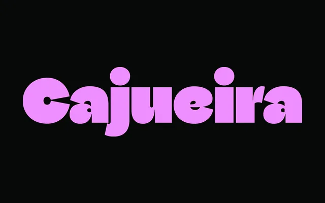
A geometric sans-serif family from Brazilian designer Sofia Mohr, comprising 18 styles across Normal and Display versions that undergo a deliberate structural transformation from open and restrained to dense and assertive as weights increase.
About
Named for the Portuguese suffix denoting a place of becoming, Cajueira treats weight progression not as a simple thickening but as a staged maturation: counters tighten, curves expand and characters draw closer together in the heaviest cuts, producing dense fields of black where text functions simultaneously as texture and rhythm. The family spans Thin to UltraBlack across Normal and Display optical versions, with two variable fonts covering each. Recognised at the 10th Bienal Tipos Latinos, the design challenges the neutrality conventionally associated with geometric typefaces by rooting its identity in transformation rather than ornament.
Classification
A geometric sans-serif built on precise vertical and curved structures, with two optical versions (Normal and Display) spanning 18 styles. The design occupies the geometric tradition while deliberately subverting its conventional neutrality through expressive weight-driven transformation.