 MegaMegaTypeType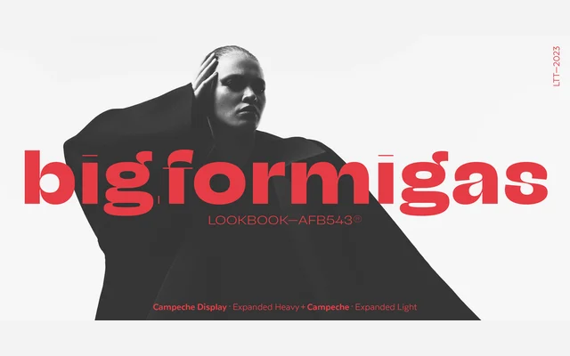
A grotesque sans from Sofia Mohr drawing on late 19th-century sources, offered across two optical styles, three widths and nine weights for a total of 54 fonts.
About
Campeche evolved from an earlier project called Seriguela, developing into its own system with a distinct personality shaped by Latin American typographic sensibility. The family splits into a text subfamily and a Display companion, each available in Condensed, Regular and Expanded widths across nine weights from Thin to Heavy. A variable font version accompanies the static styles, making the full range practical for packaging, editorial and branding work where width and weight contrasts can build hierarchical systems within a unified voice.
Classification
Rooted in late 19th-century grotesque forms with a playful Latin American inflection, Campeche sits squarely in the grotesque sans tradition while its Display subfamily and width range push it toward expressive territory.