 MegaMegaTypeType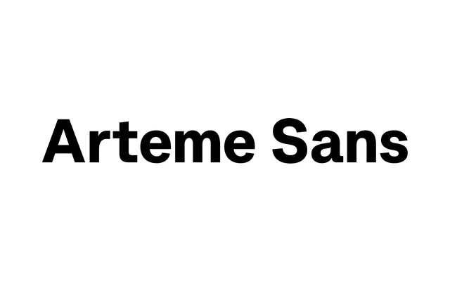
A modern grotesque that channels geometric rigour across five weights and a variable font, distinguished by slightly angled cuts that keep it from feeling cold.
About
Arteme Sans sits between strict neo-grotesque rationalism and something a degree warmer, achieving that through angled terminals rather than obvious humanist cues. Five weights each carry a full italic, and the variable Arteme Sans Flex version adds continuous weight and slant axes. Language support covers 47 Latin-script languages with 524 glyphs per style and a solid OpenType feature set including stylistic alternates, oldstyle figures and a slashed zero.
Classification
Modern grotesque with geometric and rational foundations, differentiated from strict neo-grotesques by subtly angled terminals and cuts. Part of the wider Arteme family alongside Arteme Display, which adds higher contrast and tighter spacing for mixed-use editorial settings.